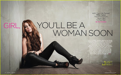
This is a double page spread taken from Billboard magazine.
The layout is quite simple with a minimal amount of text and a large background picture. However, the page isn't too packed, and doesn't make the reader just want to turn over the page because there's just a huge paragraph of text taking over the page.
The photo features pop star Miley Cyrus, in a sitting down pose in the corner of a empty grey room, I think the colour scheme is swaying more towards dark and dull colours; black, grey etc..
The title is quite eye-catching, it's alot bigger than the rest of the font and is the first thing you tend to notice at a first glance, the word 'girl' is in a different colour, pink, which I think is just to make it stand out a little bit more, and the colour pink just relates more towards females than it does to males.
I think the main point of the article was to promote her single 'Can't be tamed', which was probably in the charts at the time of the release of the magazine. The text in the white box also states, 'Transitions Form Tween Idol To Pop Star', which gives readers who don't know who she is and idea of what she does and more information.
The small white text on the right hand side talks about her audition for her lead-role on Disney Channels hit programme 'Hannah Montana', giving information about how she got the lead role and how she became a star.
The genre of Miley's music is pop, however I think over the years as she has grown up and filmed some of the last episodes of 'Hannah Montana', she has aimed to impress the older generation a little bit more with her music rather than just children who watch Disney Channel. I think this relates back to the title; 'GIRL, YOU'LL BE A WOMAN SOON', I think that this is trying imply that she has grown up and moved on in to a different era in her life and in the music industry. Also, to show people who don't already know, that she doesn't just produce music for the T.V programme 'Hannah Montana', she produces it as Miley Cyrus were she can sing about anything she wants to without any specific audience.

This is a double page spread taken from Q magazine.
On one side of the page, Lady Gaga is featured wearing a very small outfit and posing in a way which would entice readers which find the female form attractive. Her body language and lack of clothing create a raw-edge. The photograph takes up half of the article, the other half is text about Lady Gaga, so this shows that the photo has significance. It has been digitally edited from colour to greyscale, so the whole double page spread focuses on the three main colours of the magazine; black, white and red. The lack of colour on the image makes it look quite vintage, this is what makes her stand out.
Lady Gaga herself is presented to the audience as being multi-genred, as she is really well known for her pop music however she can also sway in to the rockstar sort of role. She makes different types of music for different people who like different genres, she is a very talented artist.
The enlarged, vibrant red 'L' which is featured behind the text, as well as linking to Lady Gaga's name, but also the theme and colour of Q magazine. This is also the only use of colour across the two pages, however the vibrant colour relates to Lady Gaga's sense of style and music. The double page spread doesn't have a title, there is siomple just a full A4 photograph of the main focus of the article and also her name displayed in the top right hand corner of the page. The font and italics of the word 'lady' creates class and helps the article look more appealing to the reader.
However I think this would intrigue the reader as they would have to read on to see what the article is about and to see what exclusive information Q magazine has on one of the most famous women of the moment and biggest female popstar in the world.
The first letter of each paragraph are emphasised by it's enlargment and boldness, this is a typical convention of a double page spread. The text is set out in to three seperate columns which makes it look controlled and organised, so it is easier for the reader to take in the information, I think if it was just one large block of text it wouldn't look very appealing and would look as if it would take a long time to read.
The first letter of each paragraph are emphasised by it's enlargment and boldness, this is a typical convention of a double page spread. The text is set out in to three seperate columns which makes it look controlled and organised, so it is easier for the reader to take in the information, I think if it was just one large block of text it wouldn't look very appealing and would look as if it would take a long time to read.

No comments:
Post a Comment