Sunday, 18 March 2012

Cover photoshoot.

For the cover photograph of my magazine I photographed my friend, Scarlett. 
I chose to photograph her because I think she is very photogenic and she matches the look that I want for my magazine. She has a natural hair colour and complexion. She also looks young and innocent, and also has a 'fresh' look about her, which is the look I want for my magazine. I don't want her to look provocative, like the images on most music magazine covers, I just want a sweet, innocent sort of look.
Here are a few examples of my photographs that I could use for my cover photo..


I have edited these photographs to make them brighter just by changing the brightness and the contrast of the pictures.
I made sure that my cover photo shoot was done in a studio with a white background so that I didn't have to edit the background out. With the white background I can keep the photo original without having to edit around the edge of my model giving the photo a 'rugged' edge look around her. With a white background I can easily add in text on my front cover that will stand out and attract the audience to my magazine.


This is the image that I will be using for the cover of my magazine, I have chosen this one because my model looks really natural and I like the colour of her hair. I am going to edit the photograph to my it brighter so that my front cover with stand out.
I might have to crop the photograph a little bit, as I am going to have the image aligned slightly to the right so that I can have text on the left hand side of my cover. I think I would be able to do that with any of my pictures, out of the photographs above, but I have decided on my favourite photograph.

For the photoshoot Scarlett wore a denim gilet which I think goes really well with the colour of her hair, she also wore a black leather jacket on a few of the photos.

Double page spread analysis'.

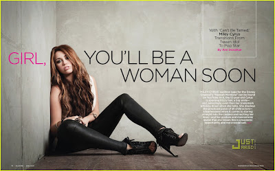
This is a double page spread taken from Billboard magazine. 
The layout is quite simple with a minimal amount of text and a large background picture. However, the page isn't too packed, and doesn't make the reader just want to turn over the page because there's just a huge paragraph of text taking over the page.
The photo features pop star Miley Cyrus, in a sitting down pose in the corner of a empty grey room, I think the colour scheme is swaying more towards dark and dull colours; black, grey etc.. 
The title is quite eye-catching, it's alot bigger than the rest of the font and is the first thing you tend to notice at a first glance, the word 'girl' is in a different colour, pink, which I think is just to make it stand out a little bit more, and the colour pink just relates more towards females than it does to males. 
I think the main point of the article was to promote her single 'Can't be tamed', which was probably in the charts at the time of the release of the magazine. The text in the white box also states, 'Transitions Form Tween Idol To Pop Star', which gives readers who don't know who she is and idea of what she does and more information.
The small white text on the right hand side talks about her audition for her lead-role on Disney Channels hit programme 'Hannah Montana', giving information about how she got the lead role and how she became a star. 
The genre of Miley's music is pop, however I think over the years as she has grown up and filmed some of the last episodes of 'Hannah Montana', she has aimed to impress the older generation a little bit more with her music rather than just children who watch Disney Channel. I think this relates back to the title; 'GIRL, YOU'LL BE A WOMAN SOON', I think that this is trying imply that she has grown up and moved on in to a different era in her life and in the music industry. Also, to show people who don't already know, that she doesn't just produce music for the T.V programme 'Hannah Montana', she produces it as Miley Cyrus were she can sing about anything she wants to without any specific audience.

 
This is a double page spread taken from Q magazine.
On one side of the page, Lady Gaga is featured wearing a very small outfit and posing in a way which would entice readers which find the female form attractive. Her body language and lack of clothing create a raw-edge. The photograph takes up half of the article, the other half is text about Lady Gaga, so this shows that the photo has significance. It has been digitally edited from colour to greyscale, so the whole double page spread focuses on the three main colours of the magazine; black, white and red. The lack of colour on the image makes it look quite vintage, this is what makes her stand out.
Lady Gaga herself is presented to the audience as being multi-genred, as she is really well known for her pop music however she can also sway in to the rockstar sort of role. She makes different types of music for different people who like different genres, she is a very talented artist.
The enlarged, vibrant red 'L' which is featured behind the text, as well as linking to Lady Gaga's name, but also the theme and colour of Q magazine. This is also the only use of colour across the two pages, however the vibrant colour relates to Lady Gaga's sense of style and music. The double page spread doesn't have a title, there is siomple just a full A4 photograph of the main focus of the article and also her name displayed in the top right hand corner of the page. The font and italics of the word 'lady' creates class and helps the article look more appealing to the reader.
However I think this would intrigue the reader as they would have to read on to see what the article is about and to see what exclusive information Q magazine has on one of the most famous women of the moment and biggest female popstar in the world.
The first letter of each paragraph are emphasised by it's enlargment and boldness, this is a typical convention of a double page spread. The text is set out in to three seperate columns which makes it look controlled and organised, so it is easier for the reader to take in the information, I think if it was just one large block of text it wouldn't look very appealing and would look as if it would take a long time to read.

Contents pages analysis.

Q magazine contents page.
The main picture on this contents page is one of The Courteeners. It looks as if the image has been taken in a specific place,  on a hill top with a vert distant back ground, which could be real, or could have been edited in, however either way it still looks real.
The Courteeners style of music is quite 'indie', which shows that the genre of music in this magazine is varied a lot. This also means that the magazine has a very large target audience as it doesn't just specify on one type of music throughout the magazine.
The style of font is simple and varies very little. The colour scheme is black/white/red, which supports the same style as the cover of the magazine.
The information is neatly organised in to different sections on the page, including; 'features', a review section, and also an 'every month' section - this is to keep readers interested in the magazine, giving them reasons to carry on buying it and also so that they know what to expect in the next issue.
The page is very easy to understand and is not all 'jumbled up' or hard to work out, the page numbers next to each part inside the magazine are clear. The sections are clear to see, this shows that the magazine is quite organised and you can see that the layout has been thought about properly before-hand.
There are some promotional feautures on the contents page such as promoting the names of artists telling the readers about new songs and albums to be released.
The logo of the magazine 'Q' is placed at the top of the page next to were it says 'contents', it isn't too dominant, however it is noticable. There is also a smaller one next to the subheading; 'review' which is also still noticable because of the bright red background.

The main picture on this contents page is a close up of Adele. It is quite a simple picture with a plain grey background.
By using a picture of Adele the makers of the magazine clearly know that this wil attract a lot of people as Adele is such a big artist in the music industry. The caption underneath the picture says 'Two months in the life of Britain's brightest new talent', as this magazine was published in 2008, this was near that begining of Adele's musical career, however now we know that the has grown in to one of the biggest music artists in the world.
Again the same colour theme is used - black, white, red, grey. Adele herself also fits in with this colour scheme, wearing a black top and red/pink lipstick.
The layout is the same as the contents page above, set out in different sections with small sub-headings to go with each section. It's very easy to read and understand and it is clear to see were each section starts and finished. As above, next to heading and subheading is the logo 'Q', which is easy to point out on the page.


This contents page is from the NME music magazine. 
This one is quite different in comparison to the Q magazine contents pages, in my opinion I like this one better, just because it looks much more interesting and it isn't as plain. 
The main image/images are set in the middle of the page, (slightly to the left), they are action shots of bands playing instruments.
Along the left hand side of the page, there is a long list of band names with the title 'BAND INDEX', this tells the reader that the magazine is not just based on one genre of music and there are many bands which will fit in to many different audience types.
On the right hand side is the contents of the magazine, there are 5 different sub-headings which all represent different areas of the magazine contents, as well as an extra 'PLUS' sub-heading at the bottom of the page. There are also little arrows which indicate the stories which were shown on the cover, this makes it easier for people to read the magazine if they want to find a certain page quickly.
There is also a small story on the contents page with the heading 'Everyone got on board Africa Exprez', an exclusice about the band Oasis, featuring other bands such as the Red Hot Chilli Peppers.
The font used on the page appears to be the same font, apart from maybe the sub-headings the font looks as if it remains the same throughout all of the text on the page. The main colour theme is red and black, (with a white background). 
Although there is also some yellow text at the bottom of the page, this is the promotional feature of the contents page. Giving information on how much it is to subscribe to the magazine, the writers are obviously trying to encourage more people to subscribe with a special offer to tempt them. 


Here is an example of a Billboard magazine contents page.
The layout of this contents page is cutout in to separate blocks. Again the title is quite simple, but bold at the same time so it still stands out on the page. On the left hand side of the page is the list of songs in the charts. There's a list for 'Albums', 'Singles' and also 'This week on sale'.
There are also different content titles; 'UPFRONT' - which will be the headlines on the cover of the magazine, 'FEATURES' - other main stories within the magazine, and 'MUSIC' - all the main music headlines. There is also information at the bottom of the page with the headline 'HOME FRONT', and then also subheadings uncluding; 'events' and 'online', so this shows that the magazine is promoting upcoming events within the music industry and allowing online asccess to promote more information to the readers of the magazine.
The photographs on the contents page are of multiple artists, which are mainly medium shots with just the head and shoulders, the majority appear to be action shots of the singers performing with microphones in their hands etc.
They are all artists of different genre's, which shows that the magazine offers a wide range of music types, and this will also attract lots of different types of people with different music tastes to the magazine.
This page is also consistent in using the same font throughout the whole page within the main text, but some of the headings/sub-headings look like they might be a slightly different font to the rest.

Q magazine; cover analysis'.

Q is a popular music magazine published monthly in the United Kingdom. Q was first published in October 1986, setting itself apart from much of the other music press with monthly production and higher standards of photography and printing. In the early years, the magazine was sub-titled "The modern guide to music and more". Originally it was to be called Cue (as in the sense of cueing a record, ready to play), but the name was changed so that it wouldn't be mistaken for a snooker magazine. Another reason, cited in Q's 200th edition, is that a single-letter title would be more prominent on newsstands.


I have chosen to analyse this magazine cover because the layout is very extravagant and eye-catching it looks like an interesting magazine.
The name of the magazine 'Q' is very noticeable with its bright red background in the top left hand corner of the cover. The colour scheme stays constant throughout the cover with the colours; black, red and white. It makes the magazine look fiery, especially with the picture of Florence in the centre of the magazine, as she blends in with the colour scheme with a small, black outfit and bright red hair.
The sub-headings also stand out, again especially the one in relation to Florence and the machine, which is in red, with 'florence' in a different font to the rest. Going down the page the headings tend to get smaller until the very small highlighted red ones at the bottom, which represent other stories to fill out the magazine. 
The image portrays that the magazine will be about Florence's success, making her appear to look taller and bigger than large, famous landmarks such as The Statue of Liberty, which is obviously photoshopped but still puts across he same idea.
The photo of Florence is a long-shot/medium long-shot. Florence is a well known artist so this fact alone would draw in a lot of readers who support her, she stands out from everything else including the title, the pose she has held in the photograph somehow helps her to overpower everything else on the cover. As well as her being very central in the photograph, making this automatically the first thing you see when you look at the cover. 
Although the magazine has got 'Florence and the machine' on the cover, when looking closely you can see that they are also advertising other artists which are also mentioned in the magazine, therefore it isn't actually only aimed at people who like Florence and the machine, and people who only like the genre of music that they make.
From the large '+' symbol, readers can see that many more artists are also featured, (showing that the magazine isnt just all about one genre in particular), such as Liam Gallagher, Freddie Mercury, Robbie Williams, etc, so therefore the magazine is broadening the range of readers by making these names stand out aswell, although not so much as to overpower the point of Florence being on the cover. 
As well as this, the text in the circle in the bottom left-hand corner, also says '41 PAGES OF REVIEWS', I think this broadens the amount of readers even more as there are a lot of people who buy music magazine just to read the reviews so it's important that this stands out, and I think it stands out on the cover quite well.


Here is another example of a Q magazine cover. 
Again the theme/colours are the same, as they are on every issue of the magazine. I think it's better that way because then it's easy for regular buyers to spot the magazine.
Unlike the photo of Florence, this photograph of Cheryl Cole is a close up, and has been edited to give the 'wet look', with drops of water also included in the photo. The photograph makes Cheryl Cole look quite fierce but makes her look 'sexy' at the same time which would automatically draw in the male audience, as well as fans of Cheryls music. She looks very 'rock-chic', with the jewellery; the metal stud ring, which is easily related to rock, and clothing and the black/grey background blending in. However, Cheryl's lips are a vivid red colour which fits in with the scheme of the magazine (as did Florence's red hair on the cover above) and her skin appears to be a lot paler than usual - as though she has had a change of image to appear more 'rockstar' rather than 'popstar'.
The main headline '3 Words...CHERYL COLE ROCKS', jumps out on the cover and tends to be the first thing I want to read when I look at it. In my opinion this is a good headline because as well as 'Cheryl Cole rocks' being 3 words, she also release a debut album named '3 Words', so I think that the title could be in relation with this as well.
Across the top of the magazine cover it says 'The UK's biggest music magazine', it doesn't stand out too much, but it is eye-catching, which is why this is effective.
Similar to the cover above, there are also other artists names featured on the cover, this time on the left, such as; John Mayer, 50 cent, Midlake, which again shows that the magazine consists of not just one genre of music.
Also on this cover the font appears to stay consistent in each heading, with just different colours separating the words making certain words stand out more than others.

Billboard magazine; cover analysis.


This is the music magazine called 'Billboard', it is published in America. It is one of the oldest trade magazines in the world. It maintains several internationally recognized music charts that track the most popular songs and albums in various categories on a weekly basis. The two most notable charts are the Billboard Hot 100, which ranks the top 100 songs regardless of genre and is based on physical sales, digital sales and radio airplay; and the Billboard 200, the corresponding chart for album sales. 
I chose to analyse this magazine cover because it doesn't look like a boring magazine, first of all, the title is very simple but effective at the same time. Its bold and has colour, i.e. inside the B (red), O (yellow), A (blue) etc, so it stands out and is very eye-catching. 
The image on the cover is a medium long-shot of Beyoncé, I think it's very important to have a well known face on the front of a music magazine of this kind; Beyoncé is an icon, she is an idol to millions of fans all over the world, so, having an artist as big as this on the cover will make the magazine very eye-catching towards the targeted audience. The photograph shows Beyoncé holding a trophie which suggests the photograph is from some sort of music awards. She is wearing a very striking outfit that makes her stand out from everything else on the cover of the magazine. 
Billboard is an all round music magazine, reporting on the latest news, issues and trends across all genres of music, however with this cover featuring Beyoncé, it tells the reader that this magazine will be largely focusing on pop/hip-hop/R&B.


The writing on the cover uses various different sizes and colours, the three main colours are yellow, white and pink. One of the top headlines on the cover being; 'BEYONCE MAKES HISTORY', which just shows how big of an artist she is within the the music industry. We can see that this is the main story as it is in a larger font size than the rest of the writing and is also a lot bolder.
The style of font seems to remain consistent throughout the whole cover, which proves to be quite effective because the colours and sizes take over in making the writing stand out.


The layout is quite simple, with Beyonce in the center surrounded by text, and the title partly hidden behind the image. The background helps to make the image stand out even more as it is aligned in the centre with several lines coming from the centre point of the photograph, which implies, 'all eyes on Beyonce', making her the centre of attention, which at the time that the photo was taken, she was, so it was very appropriate and effective.


Overall I like this magazine cover and I think the layout is quite effective, I wouldn't change anything about this cover.


This is another Billboard magazine, it's quite different to the cover with Beyonce on the front.
The photograph of Rihanna is full of vibrant colours, mainly bcause of the hair colour being red, but this is what makes it stand out. The photograph is a medium close up of Rihanna, and facial expressions can easily be seen. This pose also makes Rihanna look confident with herself and her position in music.

 The background is black, with just a few red roses in the bottom right-hand corner of the cover which match with the colour of her hair. The cover stands out very well 

The headlines, mainly on the left hand side of the cover tells the reader what and who will be included in the magazine. The main headling being about Rihanna, with her name in large, bold, capital letters going across the whole cover, also in a different style of writing and in italics. The 'caption' underneath this writing is also bold and italic, but smaller than the main headline, we can also see that this is a quote as it has apostrophes at either end. It reads, 'my fans don't really know who I am'; this is going to draw the reader in to the magazine and make them want to buy it so that they can read the story inside. Apart from this main headline, the font throughout the other headlines is consistently the same. However there is also text at the top of the page which also stasnds out as it is a bright yellow colour and the rest of the text is white.
The layout is similiar to the first Billboard magazine cover I analysed with Beyonce on the cover, but this one just has headlines down the left hand side of the page as the photograph of Rihannah is slightly more aligned to the right so her face is not quite central. However the title is always in the same place and doesn't change colour or font, again with the top of Rihanna's head covering a part of it, (as was Beyonce's in her cover).
The bar code is placed in the bottom left hand corner, ensuring that it is away from the main cover lines, so that the attention is kept towards the main features of the magazine.
Underneath the bar code are two websites 'www.billboard.com', and 'www.billboard.biz', this lets readers know were they can find out more about the magazine.


Preliminary project.

Before I started the preliminary project I had never used Photoshop before so I had to learn how to use the program as I was going along which was quite hard and took a while to get used too, I had some help using it for the first time off friends and teachers as I had no idea how to use it.
Firstly we took pictures around the college to use for the preliminary magazines, which had to be a medium close-up. I took several photo's of Liz and decided that this one would be a good choice as one of my main headlines was going to be 'Girl gets in to Oxford with her straight A* exam results'; so as she looks quite happy on the photo I thought this one would be appropriate.
The main colour scheme of the magazine is blue, black and white, this is because I associate these colours with the college and also because they go quite well together aswell. I named the magazine 'Winstanley Weekly' because its simple and makes it obvious to the reader as to what the magazine is going to be about, also as it is only the preliminary project I wanted to name it something simple because it was just to show that we could use the programme and make a simple magazine cover.
On the cover I used a simple font called 'Georgia', I didnt want to use a font that was too complicated as in my opinion I think a simple font looks better and is easier to read, most magazine covers just use simple fonts also, because they can be made to stand out and are eye catching. I used different coloured fonts and used the italics tool. Also I added a bar code at the bottom off the page, I used a photo off google images for this. At the top and bottom of the page I added black borders.I also made a contents page to go with the front cover, I just did it in blocks to show the layout that I would have used if I'd have filled it all in.
The photo on this page was also taken at college and is the same girl as on the cover of the magazine.